Showing posts with label design. Show all posts

Friday, June 19, 2009

Tiger Up Yer Butt!

When I set out to do this, my mantra was "simple, cartoony", but as it went along, I added more detail, and now it's become "awkward, weird." That's cool baby, the T-Man rolls with the punches. I did play around with some new coloring techniques, so it's not a total wash. I used Adobe Illustrator's Live Paint for the first time, and I worked light to dark rather than dark to light. If I had any confidence in myself to follow through with it, I'd say maybe this was the beginning of a series of Street Fighter characters. Since I know myself better than most, I say this very well might be my last post ever.


This was an experiment I did while I was fucking around with ways to manipulate photos in Illustrator. It kind of looks like shit, but I learned a lot of stuff. Primarily that Suzy's dad looks pretty awesome in shutter shades.


Click on those sumbitches to biggerize them. You all know this by now, right? I get paranoid sometimes that my resized, pixelated images will be mistaken for the final product. I mean, they'll look like ass either way, but I want to ensure you're looking at the RIGHT ass. I want you to look at MY ass, the way God and I intended it.

Monday, May 18, 2009

Odd's 'N' Ends...

Random stuff I had laying about from the last week. The first was going to be Sabretooth and X23 for the weekly sketch group at Pencil Jack, but I wasn't feeling it and bailed.


This is a logo/t-shirt design for Chance's ultimate frisbee team. I didn't do much on this aside from tighten up and extrapolate a bit from his original sketch (which can be found below this).

I'm still hoping to find the time to pick up a pencil over the summer, but fate seems to be conspiring against me on that. Just today I was already to go, and then our work computers all had to be hauled off for some kind of repair/upgrade. I'm writing this on a laptop. Next week, god dammit!

Wednesday, November 05, 2008

I Don't Want to Work, I Just Wanna Bang on the Drum All Day...

Quick update to a previous post. This is the finished design I went with for our work blog. I kept the same basic layout as the old one, which is here if anyone missed it and cares. The bear is pretty lame (though a bear was specifically requested...for some reason), but I ended up liking his presence as it gave me something to fuck around with on holidays and stuff. This is what I put in place on Halloween, for example. I'm working on a Thanksgiving one at the moment, but I fear I may not have allowed enough room at the top for his ridiculous pilgrim hat. Fucking pilgrims, did they contribute anything to the world except for giving John Wayne an awesome catch phrase? Probably not, but I'm not good at history.

Thanks for your help on the last post, Ryan.

Tuesday, September 30, 2008

Bearback...

I was tasked with coming up with a logo for our work blog that featured "Grizz, the Info Bear" (it's a long, and tedious story). After about a dozen attempts of varying stylization (but consistent terribleness) I decided to go the route of a true professional, and lazily recycle the understructure I used for my last post. Classy!


If anyone reads this in the next day or so, please, give me your honest, no holds barred feedback. This is for work, so I want to know if I'm posting garbage for dozens of people to see. If it's some ass, tell me it's some ass. If it gives you boners, tell me it gives you boners, then report to jail.

In an effort to keep it simple, easily reproduced and easily adjusted in size, I decided to forgo any type of inking/line weight and use the straight up stroke tool in Illustrator. I worry that may have backfired and the result is hacky and amateurish. The background paint splatter is most likely a temporary place holder until I figure out a color scheme, and I'm sure I'll add titles/text for the final. If you want to know specifically what it will be used for, go here to see what I'm working (inflicted?) with. I'm going to replace the whole thing, but I'm keeping the same basic structure, so bearforce 1 over here is going to take the place of "George Mason University" in the upper right hand circular area over there. If you have feedback on what I can do with the rest of that jonx, I'd love to hear that as well.

Thursday, June 12, 2008

Dragon Balls...


This was my most ambitious one yet due to the gun and all the shadows, so it's also my weakest one yet. The figure is hard to read, and the likeness is especially bad. Whatevs.

Supposedly the Chinese characters say "kung fu dragon", but I don't speak Chinese, so in reality they probably say something about testicles and candy (which would be ironic, as those were the characters I was actually looking for). Also, here's an earlier version before I went ape shit on doo-dads.

Tuesday, June 10, 2008

Warning: Mad Skillz Alert!

This took both a lot of time and a lot of talent.


*Sorry Ryan, but you totally looked like a pompous dick in that photo.

Monday, February 11, 2008

Mermanarchy!

More Illustrator/Photoshop dicking around. I figured I had kind of a nautical theme going with the squid thing and pirate dude, so here's a mermaid, that, knowing me, probably looks like a dude. I got a little ambitious on the color, using gradients and other madness I have no real understanding of. Something looks a little off when I flip the image in Photoshop, but I can't quite figure out what that is exactly...


Thursday, February 07, 2008

Piratical...

"Wow Todd, that's totally a face. Do you not charge money for dazzling us with such excitment?" Yeah, it's boring, but it took me literally six fucking hours, so go to hell. I wish I'd made him more grizzly, and gnarled, with more exaggerated style and, like, barnacles and scurvy on his face and shit, but working, as I do, with a mouse (as I'm so fond of mentioning) I tend to fall back on the safety of straight forward structure. Maybe next time. Next time I have, again, six fucking hours of free time. Also, I totally cheated and basically drew half a face. If you look not so closely, you can probably see that I mirrored the ears, hair, and beard. I did that because real faces are 100% symmetrical in real life.


Yeah, weird placement of the image. I was feeling frisky.


If I may detour into (further?) arrogance, I have to say that looking back on what I used to do with Illustrator, I've made huge strides. Check out this piece of shit I found in my Photobucket account:


Seriously? I don't like to toot my own horn, but toot toot mother fucker!

Lastly, 2 posts in 2 days= I win!

Wednesday, February 06, 2008

Cephalopodunists...

Goofing off at work, trying to brainstorm a new logo...which then somehow became a shirt? Yeah, I'm not totally in love with my own work at all. I mean, everyone else is, but I'm not.


Thursday, October 18, 2007

Blogunists

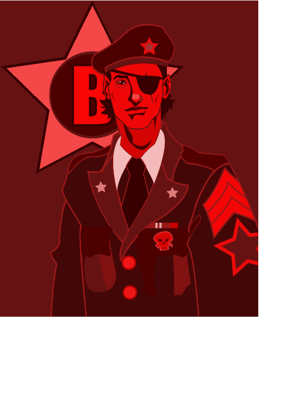
We have this blog that we use at work to keep all of the students and staff up to date on important University happenings that we may receive a lot of questions about. Back in the day, I used to be one of the primary contributors, both in writing the posts and maintaining the site. As of this semester, I've pretty much taken a back seat to let someone else have a stab at it. For a couple of years we had this really generic template in place that I threw together in Photoshop. It was yellow and green Mason colors with photos of the campus, the Johnson Center...it was pretty fucking lame. Now that it's in new hands, we figured we'd redesign the look a bit to match the current "theme" we have going on at work. The theme is "The J-Team" and we deck out all of our shit with A-Team or military style decor. The current show runner assembled the one that's in place at the moment, but he asked me if I wanted to contribute anything. I had grand plans of a propaganda styled background, but I couldn't get it to work out in a way that I was happy with. I cobbled together the left over assets I'd made into this half assed monstrosity:


It's entirely too busy and confusing. Graphic design is not something I have any talent for, though it is something I'm constantly wanting to research and improve upon. Anyway, I was supposed to leave work 5 minutes ago, so I'm shutting the fuck up.

I guess if we ever get around to redesigning the Bombunists site, I've got a load of assets we can use in a pinch.

Monday, September 10, 2007

Face Off...

I know this doesn't really take much technical ability, but I haven't drawn in weeks and I felt shamed by the recent (to me anyway) activity here. There was a month or two there where I posted every few days or so, I don't want to fall back to my old routine of posting once a month. I really want to make it a point to study more graphic design theory, because let's face it, this cluster fuck of shapes and hues in the background is like a technicolor dagger to the eyes.


The white globs everywhere are my avant garde, symbolic representation of semen. Artsy!

(click to get rid of the jaggies)

Thursday, July 26, 2007

Unintelligent design...

I was playing around with logos and shit today, not for any real reason other than my own amusement. I don't know that I'll ever apply any of this to anything, but seeing as how we're going to redesign the forums when phpbb3 comes out, I felt the urge to mess with design elements. I wish I was better at graphic design...almost as much as I wish I was better at not being ridiculously attractive.

(Click for full size versions)


The only thing I really created from scratch was the actual bomb, the fonts are from 1001freefonts.com...ok, yeah, basically I'm saying I didn't do any work on this.